R - Heat maps with ggplot2
Heat maps are a very useful graphical tool to better understand or present data stored in matrix in more accessible form. E.g. they are very helpful during seeking/comparing missing values in time series or checking cross-correlations for large number of financial instruments.
Before we present how to plot heat map in ggplot2, we will start with very simple example related with image() function. First, let's create simple matrix.
mat <- matrix(c(1, 2, 3, 10, 2, 6), nrow = 2, ncol = 3)
print(mat)

# Output:
#      [,1] [,2] [,3]
# [1,]    1    3    2
# [2,]    2   10    6
Next, we can prepare basic heat map.
image(mat, xlab = 'Matrix rows', ylab = 'Matrix columns')
And the result of the command above is:
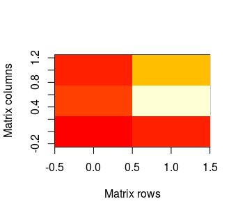
As one can see, the x axis represents rows in matrix. The first row is on the left (the lowest value on the axis), whilst the last row in on the right (analogously - the highest value). The y axis represents columns and first column is on the bottom. And by default, red colour represents the lowest values in our matrix, while the highest are lighter. NAs remain transparent, so it means that in this case they will be white - like plot background.
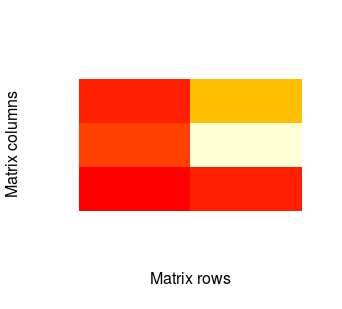
We can make our plot slightly mode pretty by removing axes:
image(mat, xlab = 'Matrix rows', ylab = 'Matrix columns', axes = F)
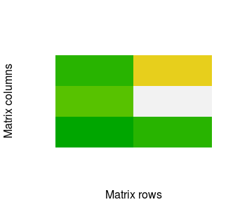
There is also possibility to change default colours by using col parameter. In example:
image(mat, xlab = 'Matrix rows', ylab = 'Matrix columns', axes = F, col = terrain.colors(100))
The image() function is very handful for quick plot. However, with ggplot2 we can obtain much nicer results. So let's check how to do it. First, we need three packages. If you do not have them then you need to install ggplot2, RColorBrewer and reshape2. Then you can call:
# Import packages
library(ggplot2)
library(RColorBrewer)
library(reshape2)
Before we'll plot heat map in ggplot2, we have to transform our data into melted form with melt function from reshape2.
mat.melted <- melt(mat)
print(mat.melted)

# Output:
#   Var1 Var2 value
# 1    1    1     1
# 2    2    1     2
# 3    1    2     3
# 4    2    2    10
# 5    1    3     2
# 6    2    3     6
Then we can call:
ggplot(mat.melted, aes(x = Var1, y = Var2, fill = value)) + geom_tile()
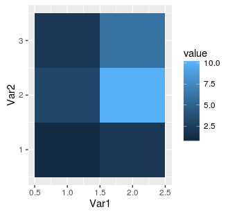
As we can see, the numbers on axes in the middle of each tile indicate position in the source matrix. However, if we add dimnames to our matrix then ggplot2 will automatically use these names:
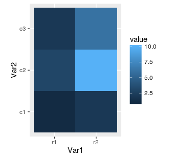
mat <- matrix(c(1, 2, 3, 10, 2, 6), nrow = 2, ncol = 3, dimnames = list(c('r1', 'r2'), c('c1', 'c2', 'c3')))
mat.melted <- melt(mat)
gplot(mat.melted, aes(x = Var1, y = Var2, fill = value)) + geom_tile()
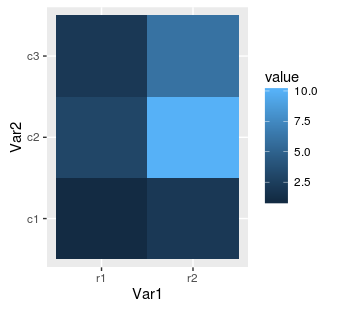
Next, we can replace our rectangular tiles by squares with coord_equal():
ggplot(mat.melted, aes(x = Var1, y = Var2, fill = value)) +
  geom_tile() +
  coord_equal()
It's often cool feature when our matrix has equal number of columns and rows. Finally, we can also change the colours using RColorBrewer package.
hm.palette <- colorRampPalette(rev(brewer.pal(11, 'Spectral')), space='Lab')
ggplot(mat.melted, aes(x = Var1, y = Var2, fill = value)) +
  geom_tile() +
  coord_equal() +
  scale_fill_gradientn(colours = hm.palette(100))
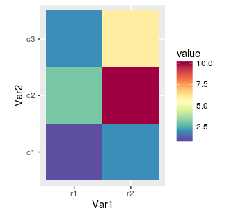
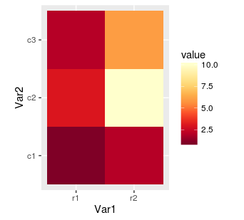
We can control colours with brewer.pal function from code above. The first parameter means number of colours and depends on chosen palette. The list of available colour sets is described in function's help (?brewer.pal) and on website. Below is the another example, this time with sequential palette:
hm.palette <- colorRampPalette(rev(brewer.pal(9, 'YlOrRd')), space='Lab')
ggplot(mat.melted, aes(x = Var1, y = Var2, fill = value)) +
  geom_tile() +
  coord_equal() +
  scale_fill_gradientn(colours = hm.palette(100))
At the end, we can also overwrite axis labels as well as rotate values on scale. Rotating can be very helpful when dirnames are long and there are many rows. As without it the labels will be impossible to read.
ggplot(mat.melted, aes(x = Var1, y = Var2, fill = value)) +
  geom_tile() +
  coord_equal() +
  scale_fill_gradientn(colours = hm.palette(100)) +
  ylab('Matrix columns') +
  xlab('Matrix rows') +
  theme(axis.text.x = element_text(angle = 90, hjust = 1))
